Maestro: organize!

I organize. I tweak. I optimize. I categorize. And I love music.

For a few months now I’ve been feeling more and more annoyed by the anarchy reigning in my Spotify library. Time for some action! However, I need a system.

Why do I bother my handful of readers with this? Heck, I don’t know; feel free to skip this series of short posts about my playlists. Why do I bother at all writing this? Because I have no clue yet how to organize my music. Perhaps writing down my options will help…. organize my thoughts.

First things first: which feature to use for organizing things? The “Your Music” feature of Spotify is useful and useless at the same time. It is just one big bucket for all your saved songs and albums, to be browsed only by artist or album. With 1000s of “my songs” this won’t be all too useful. I will be using that feature some 10% of the time for finding music, but for the other 90% I need a different system. Why? Because I tend to decide on a “type” of music before I choose an album or a song.

Playlists” are the other option, as Spotify so humbly tells us:

Playlists are collections of tracks you can build for moods, events, etc. And since you can make as many playlists as you like, the only limit is your imagination.

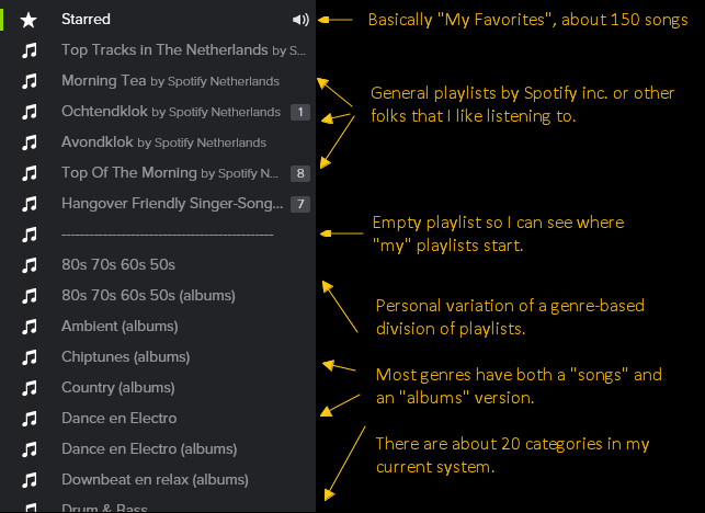
Currently, my setup for playlists is along these lines:

Spotify Playlists

There are several minor problems with this system:

  • The “divider” playlist is an ugly little hack.
  • The duplication (every genre appears twice, once as “songs” and once for “albums”) bothers me.
  • The names for others’ playlists are not at all informative.
  • The list can become quite long (20+ genres times 2 makes 40+ entries).

Then there are some bigger problems with this system:

  • This system lets me find an album by genre, but still requires me to scroll through a lot of songs to find an album I want.
  • Within a genre there can be big differences (some broader genres are more prone to this problem), so just randomly playing songs from a certain list is not an option.

Or, let me put it more bluntly:

  • I can’t quickly find shit.
  • The effect of a shuffled playlist is shit.

Okay, that helped. Now I know what my problem is. Time to try a new system for size. Or perhaps, given that I have two problems, I should have two systems?

CSS syntax naming conventions – REDUX

I’ve blogged about CSS naming conventions before. The Stack Exchange question I referred to then has since been closed (for understandable reasons). However, it recently also started gathering “delete” votes. Given that I don’t have enough reputation to see deleted posts on Programmers.SE, I intend to salvage up front whatever info was in that post and it’s answers here.

So, here’s the redux version of my post, along with the answers. If anything, this’ll be a good excercise in following the cc-by-sa license from Stack Overflow.


Question: what are the practical considerations for the syntax in class and id values?

Note that I’m not asking about the semantics, i.e. the actual words that are being used. There are a lot of resources on that side of naming conventions already, in fact obscuring my search for practical information on the various syntactical bits: casing, use of interpunction (specifically the - dash), specific characters to use or avoid, etc.

To sum up the reasons I’m asking this question:

  • The naming restrictions on id and class don’t naturally lead to any conventions
  • The abundance of resources on the semantic side of naming conventions obscure searches on the syntactic considerations
  • I couldn’t find any authorative source on this
  • There wasn’t any question on SE Programmers yet on this topic :)

Some of the conventions I’ve considered using:

  1. UpperCamelCase, mainly as a cross-over habit from server side coding
  2. lowerCamelCase, for consistency with JavaScript naming conventions
  3. css-style-classes, which is consistent with naming of css properties (but can be annoying when Ctrl+Shift+ArrowKey selection of text)
  4. with_under_scores, which I personally haven’t seen used much
  5. alllowercase, simple to remember but can be hard to read for longer names
  6. UPPERCASEFTW, as a great way to annoy your fellow programmers (perhaps combined with option 4 for readability)

And probably I’ve left out some important options or combinations as well. So: what considerations are there for naming conventions, and to which convention do they lead?


Amos M. Carpenter answered:

Bounty or not, to some extent the choice will always be a “matter of preference” – after all, how would you feel if the W3C recommended (or even imposed) a certain convention that you didn’t feel was right?

Having said that, though, I personally prefer the lowerCamelCase convention, and I’ll give the reasons and practical considerations I’ve used to make up my mind – I’ll do so by a process of elimination, using the numbering from your question:

(5.) justnoteasilyreadablebecauseyoudontknowwherewordsstartandend.

(6.) ASABOVEPLUSITSANNOYINGLIKESOMEONESHOUTING.

(4.) historical_incompatibility_plus_see: Mozilla Dev Documentation.

(3.) a-bit-trickier-to-explain… as you mention, selectability in text editors is one issue (as with underscores, depending on the editor), but for me it’s also the fact that it reminds me of the syntax reserved for vendor-specific keywords, even if those start with a hyphen as well as having words separated by them.

So this leaves your (1.) and (2.), UpperCamelCase and lowerCamelCase, respectively. Despite the mental link to Java classes (which are, by a more clearly defined convention, UpperCamelCase), CSS class names seem, to me, to be better off starting with a lowercase letter. Perhaps that is because of XHTML element and attribute names, but I guess you could also make the case that having CSS classes use UpperCamelCase would help to set them apart. If you need another reason, lowerCamelCase is what the W3C uses in examples for good class names (though the URL itself, annoyingly, disagrees with me).

I would advise against (4.), (5.) and (6.), for the reasons stated above, but suppose that arguments could be made for either of the other three.

Whether or not you (or anyone else for that matter) agree with me on this matter is up to you though. The fact that you haven’t got a definite answer quoting authoritative sources by now can be taken as a hint that there isn’t such a thing as a definite standard on this issue (else we’d all be using it). I’m not sure that’s necessarily a bad thing.


Emanuil Rusev answered:

Words in CSS class names should be separated with dashes (class-name), as that’s how words in CSS properties and pseudo-classes are separated and their syntax is defined by the CSS specs.

Words in ID names also should be separated with dashes, to match the syntactic style of class names and becaus ID names are often used in URLs and the dash is the original and most common word separator in URLs.


tdammers answered:

It’s mostly a matter of preference; there is no established standard, let alone an authoritative source, on the matter. Use whatever you feel most comfortable with; just be consistent.

Personally, I use css-style-with-dashes, but I try to avoid multi-word class names and use multiple classes wherever possible (so button important default rather than button-important-default). From my experience, this also seems to be the most popular choice among high-quality web sites and frameworks.

Lowercase with dashes is also easier to type than the other options (excluding the hard-to-read nowordseparatorswhatsoever convention), at least on US keyboards, because it doesn’t require using the Shift key.

For id’s, there is the additional practical consideration that if you want to reference elements by their ID directly in javascript (e.g. document.forms[0].btn_ok), dashes won’t work so well – but then, if you’re using jQuery, you’re probably going to use them through $() anyway, so then you can just have $('#btn-ok'), which makes this point mostly moot.

For the record, another convention I come across regularly uses Hungarian warts in ID’s to indicate the element type, especially for form controls – so you’d have #lblUsername, #tbUsername, #valUsername for the username label, input, and validator.


asfallows answered:

I strongly believe the thing that matters most is consistency.

There are two ways to look at this:

  1. A good argument can be made for alllowercase or css-style-clauses (probably the better choice) because they will be the most consistent with the code they’ll be in. It will lend a more natural flow to the code overall and nothing will be jarring or out of place.
  2. An equally good argument can be made for a style that is distinct from HTML tag names or CSS clauses, if it will differentiate IDs and classes in a way that aids readability. For example, if you used UpperCamelCase for IDs and classes, and didn’t use it for any other construct or purpose, you would know you had hit on one every time you saw a token in that format. One restriction this might impose is that it would be most effective if every ID or class were a 2+ word name, but that’s reasonable in many cases.

In writing this answer out I came to find that I’m much more inclined toward the second choice, but I will leave both because I think both cases have merit.
Ragù Bolognese part 2 of 2

After researching the heck out of Bolognese Sauce in part 1, here are the results.

Ragu Bolognese (result)

This is, in hindsight, the general recipe we followed (based on the “official” recipe).

Ingredients

For the sauce:

  • Ground Veal / Pork (50/50)
  • Pancetta
  • Onions
  • Carrots
  • Celery
  • Tomato Paste
  • Dry White Wine
  • Beef Stock
  • Extra-virgine Olive Oil
  • Milk
  • Cream
  • Salt
  • Pepper

For the tagliatelle:

  • Flour
  • Eggs
  • Extra-virgin Olive Oil

And to finish off:

  • Parmezan Cheese

Steps

Part 1 is preparing and making the sauce:

  1. Cut the OnionsCarrots, and Celery brunoise.
  2. Stir-fry the three of them in some oil for about 8 minutes.
  3. Add the Pancetta and Ground Meat and stir-fry for another 8 minutes.
  4. Add Tomato Paste, some Extra-virgin Olive OilDry White Wine, and Beef Stock.
  5. Let it simmer for a few minutes.
  6. Add a splash of Milk.

Part 2 is letting the sauce get it’s flavor:

  1. Turn down the heat such that the sauce is simmering very slowly, leave it at that for about 4 to 6 hours, adding beef stock whenever it would get too dry.

Part 3 is making the pasta (the basics only, below won’t serve as a detailed pasta recipe):

  1. Mix Flour and Eggs and a little bit of Extra-virgin Olive Oil.
  2. Knead until mixed well (when pressing the dough it should bounce back a bit).
  3. Tightly wrap in foil and let it sit for 30 minutes.
  4. Use the Pasta Machine to roll out Tagliatelle.

Finishing up is as simple as:

  • Cooking the fresh pasta in a lot of very salty water;
  • Adding some Cream to the sauce and let it simmer along for a few minutes;
  • Draining the pasta, plating up, and grating some Parmezan Cheese on top.

So, how did the finished result turn out to be? Great, actually. Very different from “Spag Bol” indeed. We did decide that plain ground beef would’ve been nicer than veal, and that perhaps it would be wise to fry off the beef seperately. Oh and the fresh pasta makes quite a difference too.

Bon appetit!

1995: It was a very good year…

Apparently, 1995 was a very good year. But wait, I get ahead of myself!

Recently I had a conversation with a friend about CMSes. We were confused, disagreeing on whether “Django” was a CMS or a web application framework. Neither of us was entirely sure, both of us being developers in the Microsoft stack.

Given that looking for (meta-)comparisons, and coming up with (sometimes far fetched or even disrespectful) parallels is a “secret” hobby of mine. So why not attempt to insult as many technology zealots in one go as I can by comparing popular technologies? At the very least I’d find out if Django is a CMS or web framework.

Turns out it is both.

Of course, finding parallels is hard and at times nearly impossible. Platforms and technologies differ and overlap at times, making a tabular comparison quite a challenge. Here’s my (first) attempt at a comparison:

Web App Framework(s) Example CMS(es) Package Manager(s) IDEs
C# (and VB.NET)

Current: 5.0
Originated: 2000
Microsoft

ASP.NET: WebForms & MVC DotNetNuke, Orchard NuGet Visual Studio, MonoDevelop, SharpDevelop
Java

Current: 8
Originated: 1995
Oracle

Spring, JSF, Struts, Google Web Toolkit, etc. Liferay, Hippo, Open CMS, Pulse Maven Eclipse, IntelliJ, NetBeans
PHP

Current: 5.6.0
Originated: 1995
The PHP Group

Zend 2, CakePHP, CodeIgniter, Symfony WordPress, Drupal, Joomla! Composer PhpStorm, PHPEclipse, Zend Studio, NetBeans, Sublime Text
Ruby

Current: 2.1.2
Originated: 1995

Ruby on Rails Radiant, Refinery, BrowserCMS RubyGems n/a
Python

Current: 3.4.1
Originated: 1991
Python Software Foundation

Django Django-CMS, Plone Pip, PyPM n/a
JavaScript (Node)

Current: 5
Originated: 1995
Joyent

Node.js Ghost, KeystoneJS, Hatch.js, Calipso npm n/a
Perl 5

Current: 5
Originated: 1987
The Perl Foundation

Catalyst, Dancer, Mojolicious Bricolage nCPAN, PPM n/a

There were two main takeaways from this comparison for me. First, apparently “Django” is a Python web application framework, and “Django-CMS” is, well: a CMS. Second, 1995 was a very good year: Wikipedia lists 4 out of 7 languages as originating in 1995.

Guess it was a very good year.

Ragù Bolognese part 1 of 2

Apparently, northern european countries were doing it all wrong! There is no such thing as Spaghetti Bolognese, at least not in the country we think spawned the dish. Here are the main things that are wrong with “Spagbol”:

  • It is not served with spaghetti, but with tagliatelle (or if not that, with some other broad type of pasta).
  • It has no herbs or garlic in it. It’s a meaty sauce with some vegetables, but no herbs.
  • There are no fresh tomatoes in it. Instead, either paste or canned tomatoes are used.
  • It is not a quick dish. It has to sit on the stove for several hours.

Wow. I’ve been sinning against Italian cuisine for a long time!

So it’s time to set things straight, time to try out the real Bolognese Sauce. First things first, I needed to check if there’s an official recipe. The Wikipedia page is usually a good start. However, I’d rather be sure that I have a recipe as authentic as possible. So I went back to my old favorite cooking.stackexchange.com and asked what the key ingredients are.

The answer I accepted links to an “official” recipe by Accademia Italiana della Cucina. However, this didn’t hold me back from creating my own answer. I compared several prominent recipes, which led me to the following ingredient summary:

Must Haves:

  • Onion
  • Carrot
  • Celery
  • Ground Beef
  • Tomato Paste
  • Salt
  • Pepper

Should Haves:

  • Olive oil (usually extra-virgin, but the “official” source mentions regular oil)
  • Pancetta
  • Milk
  • Ground Veal and/or Pork †
  • Dry White Wine (incidentally recipes mention red wine instead)
  • Beef Stock (incidentally chicken stock instead)

† The only ingredient not in the “official” source’s recipe, that is found in most other recipes.

Honerable mentions:

  • Cream (the only “official” ingredient not found in most recipes)

Ingredients usually not mentioned:

  • Bacon (instead of pancetta)
  • Tin crushed tomatoes
  • Fresh tomatoes (never mentioned!)
  • Sieved tomatoes
  • Butter
  • Cloves
  • Bay Leaves
  • Nutmeg
  • Cinnamon
  • Basil
  • Oregano
  • Parsely
  • Sugar

So, armed with that knowledge, and a basic recipe, I’ll soon be attempting to make a classic Ragù Bolognese. With fresh tagliatelle.

To be continued…

CSS Kata “The Lord of the Rings”

After last kata I’d really had it with CSS-ing “true semantic” markup. So this time I went all out: bend the markup backwards as far as it’d go. And though the html-gods may strike me down, they won’t do so before I’ve created this monster:

The Lord of the Rings - Comparison

I’ve spent 1 minute on a background to match the “feel” of the original poster, and a good 2 hours fiddling on the markup and CSS. The result felt moderately pleasing. I only felt like doing the easy bits, so I left the things I didn’t instantly know a solution to for what they were (the 3D effect on the letters, choosing a better font, etc.).

For reference, here is the monster we’re talking about:

So many spans, my eyes! Here’s the corresponding CSS:

See it in action on JSBIN.

This concludes my self-imposed challenge of CSS katas. Even though these katas (or the fact that I insisted on publicizing them) were probably not “lightweight” enough, the basic principle of doing katas was enjoyable. Perhaps I should secretly start another series…

CSS Kata “Fight Club”

I’ve now done four CSS Katas, and four times I ended up Googling “CSS first-word selector”. Of course, every time the answer was the same: not possible.

Today I made final attempt to avoid introducing non-semantic elements and use purely CSS to hack the actual movie poster together. However, it requires you to resort to some pretty hefty hacks to get things working. Take, for example, the heading for the movie stars:

Fight Club Movie Stars

In markup for this I can still rationalize grouping the two names into their own elements, but separating first name and surname feels like a bit too much. So we end up with markup like this:

Now, without a “first-word” selector: what’s left in CSS to style first names differently from surnames? All I could think of was this dirty trick:

This creates a linear gradient left-to-right, with stops at oppropriate horizontal positions: exactly between words. After that, it sets the text to clip out that background, so that you can only see the background where there’s also text. Oh, obviously this will only work in webkit browsers (and will look pretty awful in others.

Other parts of this poster were less interesting. The soap bar is mostly an excercise in text-shadow, line-height, letter-spacing, and some rotation. In any case, this is the end result, compared to the original:

Fight Club CSS Kata Result

The code for this result can be found on cssdesk, and is as follows:

And this CSS:

Next time: Lord of the Rings. Probably with full-markup-cheats turned on!

Book List – Update May 2014

Almost two years ago I posted about starting a book list. So I did, and today I also took some time updating my Book List Page.

Books "A-List" per 2014-05-11

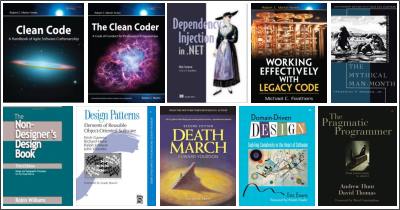
The list was growing, so I divided it into three groups. Shown above are 10 book covers from the “A List”: books which I loved reading and would highly recommend. The “B-List” are books that were well worth my time, yet aren’t directly recommended for one reason or another. The “C-List” are books I’ve read, but I’d recommend against picking them up for one reason or another.

A shout-out goes to my friend and colleague who’s been solid in providing recommendations (as well as lending me physical copies); he’s accountable for about half of the books on my A-List.

I’m in doubt what to read or do next though. Some things I’m considering:

  • Either one of the “Seven X in Seven Weeks” series (programming languages and/or databases).
  • Something about Java and/or a new book on programming for Android.
  • Anything like “PHP The Good Parts”, if it’s out there. (with topics like OO, Unit Testing, Dependency Injection, etc.)

On the other hand, I might also stick with some hobby programming or Pluralsight courses for now.

Of course I was hoping writing this post would help me figure out the question of what to do next. No luck so far though.

Ah well, the Right Thing to do will come to me with time, I guess.

Smile!

I can get curious about many things. Very different things, too. I’ve wondered whether our bodies can loose fat cells at all, why drop caps look different across browsers, and whether you can cook fish in a dishwasher. The list goes on.

The most recent item to be added to this list is about Smileys. While chatting with one of my friends I used this emoticon:

:O

I used this thinking it stands for “Surprise” or “Gasping” or “Jaw Dropping”. Instead, Google Hangouts presented us with this:

Smiley visual for :O

What the fuck is going on here!? Something’s not allright with that guy, possibly multiple things!

Turned out quite a few smileys I tend to use have rather strange visuals, with big differences between major platforms too. So I set out to do some research. Here are the results:

Smileys Overview

In the end, not too many big surprises, though there are a few. I’ve subtly highlighted the ones I’d more or less expect and which ones are not what I’d expect from the particular emoticon.

On to more useless research, I say!

CSS Kata “Face/Off”

Here’s the slogan for today’s Kata:

Commas: use them bitches!

Or in general: interpunction is important. Turns out with this poster that even certain content (e.g. slashes) may not be content after all, but just styling.

First things first though. For the Face/Off Kata the first thing I did was to get the text in there, with only a wee bit of styling to get going. This is the markup:

And this is the CSS:

For some reason I did place a “/” in the movie title, yet not between the actor’s names, even though it was clearly there in the original poster. This is probably a problem, that can be discovered by imagining how a screen reader would go about this text. Basically, the Windows Narrator tells me this:

John Travolta Nicolas Cage in order to trap him, he must become him Face slash Off June 27nd

Not good. I’ve tried to improve my markup into this, using commas and other important interpunction:

This is much, much better. It is read by Narrator like this:

John Travolta, Nicolas Cage. In order to trap him, he must become him. Face, off. June 27nd.

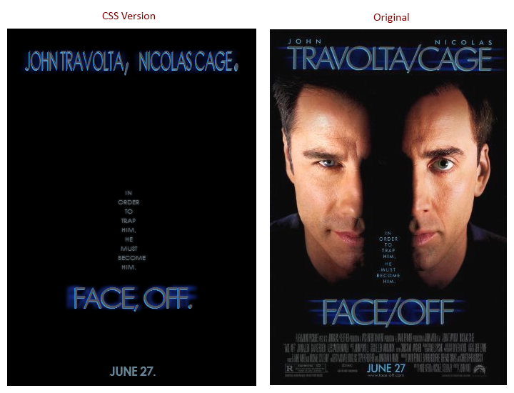
Okay, so let’s assume the Narrator is my Oracle, and this markup is perfect. This poses a challenge for my CSS to still get a resulting visual that resembles the original poster. Here’s the result I settled for (compared to the original):

Face/Off Comparison

I’m not happy with this, as in: I wish I was more succesful in finding hacks to fix the differences. These include:

  • Getting the actor names to spread out on two lines, with the actor’s first names in a smaller font. I’ve tried using “first-line”, but as soon as I decrease the font-size the second word will also fit on the first line. Highly frustrating, I see no simple solution here.
  • Replacing “, ” (comma + space) with a single “/” (slash). I’ve tried several things, including the experimental unicode-range descriptor. No dice.
  • Getting rid of the periods at the end of sentences. Alas, there is no “last-letter” or “nth-letter(…)” pseudo-selector.
  • Finding CSS to fix the horizontally stretched text shadow on the titles. A meager “text-shadow” was as close as I could get.

In short: a failed attempt. Educational, though.