What have you done for me lately? (Jan 2019)

Here’s yet another post similar to ones from September 2018 and December 2017: a recap of things I’ve been busy with in stead of writing more blog posts. It includes several blog posts I’ve written (and possibly should’ve cross-posted here?) for my employer: Infi.

One special thing of note is my previous blog post from two years ago, about “Reproman”. I had much energy and a great plan for a grand new project. First, it somehow didn’t “click” for me… and then a pandemic hits. And also my job title changes at the same(ish) time. So that project didn’t go as planned. I can firmly declare it frozen (if not dead) at this point. There, I’ve said it.

With that out of the way, let’s dive into some things that did happen since that last post.

Blog posts

I have not blogged here, on my personal blog, for two years. That doesn’t mean I haven’t been writing some new content! Let’s start with blog posts I’ve written for my employer’s blog:

Emotionally, it feels right to “restart” the list with all the stuff from “before the pandemic started“:

So no shortage of inspiration for things to write about, as you can see! Just on a different blog, is all.

I will say I’m considering pushing myself to write more frequently here, on my personal blog. But we’ll see.

Projects

In addition to writing for Infi’s blog, I’ve also been busy on a few projects. As always, you can find the more interesting ones on jeroenheijmans.nl, but here’s a couple of highlights:

That’s just a few highlights though, check my homepage for all different projects I’ve been running.

Various

Relevant to how many blog posts I can write, and how many projects I’m able to produce, is of course context. In software development, “it depends” is the standard state of things, right? It makes sense to share a few of the prime influences.

First up, since 2020, I’m not only a Technical Lead at Infi anymore. I’ve also signed up to be part of the management team as CTO of Infi Utrecht. I consider getting management responsibilities a demotion rather than a promotion, yet I feel compelled to spend part of my time making and keeping Infi a place I want to work at.

Second, of course, is the pandemic. In addition to having just about all possible privileges already, in the pandemic I also had no kids, had a great partner, and a relatively stable job. This makes (I presume) things a lot easier to handle. But still, it affected me regardless. I’ve mostly been acknowledging that, and acting accordingly. I hope you all can do so too!

Finally

In conclusion: what’s next!?

Well, I consider writing part of my job. So if you follow me on Twitter you’ll at least see my posts I wrote for Infi circulate. In addition I might write a bit more frequent here too. And if not, I’ll be sure to write another one of these “round up” blogposts in some months or years.

We’ll see.

Finishing BattleTop

Okay, the title is about as uninspired as topping a vanilla ice cream dessert with chocolate sauce. But it’s to the point! Also, with slight OCD, it’s nice that my archives will show nicely aligned “Finishing …” titles. This is important for many reasons!

BattleTop ThumbnailAnyhow, as I’ve announced recently, I had already finished wrapped up one project: BattleTop. Have a peek at the Source, or check out the Live Version.

Elevator Pitch

What would’ve been the Elevator Pitch if I had made one when I started? Something like this:

I’m developing an app for keeping combat initiative so tabletop RPG groups can skip the tedious parts and share the initiative state easily, using (mobile) devices that are present in sessions anyways.

Writing elevator pitches is far from my specialty, perhaps I should’ve said something about “the competition” too: I’ve actually looked for existing apps, and tried a few from the Android Play Store. Only a few existed at the time, and they were very unsatisfactory.

What’s it built with?

I’ll be honest: from the subset of suitable technologies, I didn’t choose based on “best for the job”. Instead, I chose two technologies that I wanted to learn more about, and stayed in my comfort zone when choosing the rest.

The initial prototype was built with:

  • Html5, because at the time I loved tinkering with the new semantic tags. Also, I intended to learn all about tinker with LocalStorage for saving state between (possibly accidental) page refreshes.
  • Custom CSS, because it’s “good enough” for a prototype, and switching to SASS or LESS later on is easy.
  • jQuery, because I thought I wanted to learn how to write jQuery plugins.

Only two days / 11 commits after I had started did I branch off to rewrite things MVVM style with KnockoutJS. I’ve not looked back since. It also paved the way for easy unit testing, allowing me to experiment with QUnit.

How’s it wrapped up?

The frequency with which our group did RPG sessions had dropped dramatically. This removes the need to have a tool, the motivation to keep developing it, and the ability to test it. And this is okay with me. I learned some cool new things, and heck: it even got it to a functional beta version.

To wrap it up I just reviewed all of my code. Unit tests had already been done in August, and even though the code isn’t the fanciest ever, it didn’t have any obvious loose ends or idiotic bugs. So after some minor changes I just added a “discontinued” warning to the code, the live version, and the project site, and that’s that: closure!

Any future for BattleTop?

Not very likely. I think I prefer to focus effort on one certain other project, and after that probably even start new projects before picking up BattleTop again.

But like I said: I’m okay with that.

CSS syntax naming conventions – REDUX

I’ve blogged about CSS naming conventions before. The Stack Exchange question I referred to then has since been closed (for understandable reasons). However, it recently also started gathering “delete” votes. Given that I don’t have enough reputation to see deleted posts on Programmers.SE, I intend to salvage up front whatever info was in that post and it’s answers here.

So, here’s the redux version of my post, along with the answers. If anything, this’ll be a good excercise in following the cc-by-sa license from Stack Overflow.


Question: what are the practical considerations for the syntax in class and id values?

Note that I’m not asking about the semantics, i.e. the actual words that are being used. There are a lot of resources on that side of naming conventions already, in fact obscuring my search for practical information on the various syntactical bits: casing, use of interpunction (specifically the - dash), specific characters to use or avoid, etc.

To sum up the reasons I’m asking this question:

  • The naming restrictions on id and class don’t naturally lead to any conventions
  • The abundance of resources on the semantic side of naming conventions obscure searches on the syntactic considerations
  • I couldn’t find any authorative source on this
  • There wasn’t any question on SE Programmers yet on this topic :)

Some of the conventions I’ve considered using:

  1. UpperCamelCase, mainly as a cross-over habit from server side coding
  2. lowerCamelCase, for consistency with JavaScript naming conventions
  3. css-style-classes, which is consistent with naming of css properties (but can be annoying when Ctrl+Shift+ArrowKey selection of text)
  4. with_under_scores, which I personally haven’t seen used much
  5. alllowercase, simple to remember but can be hard to read for longer names
  6. UPPERCASEFTW, as a great way to annoy your fellow programmers (perhaps combined with option 4 for readability)

And probably I’ve left out some important options or combinations as well. So: what considerations are there for naming conventions, and to which convention do they lead?


Amos M. Carpenter answered:

Bounty or not, to some extent the choice will always be a “matter of preference” – after all, how would you feel if the W3C recommended (or even imposed) a certain convention that you didn’t feel was right?

Having said that, though, I personally prefer the lowerCamelCase convention, and I’ll give the reasons and practical considerations I’ve used to make up my mind – I’ll do so by a process of elimination, using the numbering from your question:

(5.) justnoteasilyreadablebecauseyoudontknowwherewordsstartandend.

(6.) ASABOVEPLUSITSANNOYINGLIKESOMEONESHOUTING.

(4.) historical_incompatibility_plus_see: Mozilla Dev Documentation.

(3.) a-bit-trickier-to-explain… as you mention, selectability in text editors is one issue (as with underscores, depending on the editor), but for me it’s also the fact that it reminds me of the syntax reserved for vendor-specific keywords, even if those start with a hyphen as well as having words separated by them.

So this leaves your (1.) and (2.), UpperCamelCase and lowerCamelCase, respectively. Despite the mental link to Java classes (which are, by a more clearly defined convention, UpperCamelCase), CSS class names seem, to me, to be better off starting with a lowercase letter. Perhaps that is because of XHTML element and attribute names, but I guess you could also make the case that having CSS classes use UpperCamelCase would help to set them apart. If you need another reason, lowerCamelCase is what the W3C uses in examples for good class names (though the URL itself, annoyingly, disagrees with me).

I would advise against (4.), (5.) and (6.), for the reasons stated above, but suppose that arguments could be made for either of the other three.

Whether or not you (or anyone else for that matter) agree with me on this matter is up to you though. The fact that you haven’t got a definite answer quoting authoritative sources by now can be taken as a hint that there isn’t such a thing as a definite standard on this issue (else we’d all be using it). I’m not sure that’s necessarily a bad thing.


Emanuil Rusev answered:

Words in CSS class names should be separated with dashes (class-name), as that’s how words in CSS properties and pseudo-classes are separated and their syntax is defined by the CSS specs.

Words in ID names also should be separated with dashes, to match the syntactic style of class names and becaus ID names are often used in URLs and the dash is the original and most common word separator in URLs.


tdammers answered:

It’s mostly a matter of preference; there is no established standard, let alone an authoritative source, on the matter. Use whatever you feel most comfortable with; just be consistent.

Personally, I use css-style-with-dashes, but I try to avoid multi-word class names and use multiple classes wherever possible (so button important default rather than button-important-default). From my experience, this also seems to be the most popular choice among high-quality web sites and frameworks.

Lowercase with dashes is also easier to type than the other options (excluding the hard-to-read nowordseparatorswhatsoever convention), at least on US keyboards, because it doesn’t require using the Shift key.

For id’s, there is the additional practical consideration that if you want to reference elements by their ID directly in javascript (e.g. document.forms[0].btn_ok), dashes won’t work so well – but then, if you’re using jQuery, you’re probably going to use them through $() anyway, so then you can just have $('#btn-ok'), which makes this point mostly moot.

For the record, another convention I come across regularly uses Hungarian warts in ID’s to indicate the element type, especially for form controls – so you’d have #lblUsername, #tbUsername, #valUsername for the username label, input, and validator.


asfallows answered:

I strongly believe the thing that matters most is consistency.

There are two ways to look at this:

  1. A good argument can be made for alllowercase or css-style-clauses (probably the better choice) because they will be the most consistent with the code they’ll be in. It will lend a more natural flow to the code overall and nothing will be jarring or out of place.
  2. An equally good argument can be made for a style that is distinct from HTML tag names or CSS clauses, if it will differentiate IDs and classes in a way that aids readability. For example, if you used UpperCamelCase for IDs and classes, and didn’t use it for any other construct or purpose, you would know you had hit on one every time you saw a token in that format. One restriction this might impose is that it would be most effective if every ID or class were a 2+ word name, but that’s reasonable in many cases.

In writing this answer out I came to find that I’m much more inclined toward the second choice, but I will leave both because I think both cases have merit.

CSS Kata “The Lord of the Rings”

After last kata I’d really had it with CSS-ing “true semantic” markup. So this time I went all out: bend the markup backwards as far as it’d go. And though the html-gods may strike me down, they won’t do so before I’ve created this monster:

The Lord of the Rings - Comparison

I’ve spent 1 minute on a background to match the “feel” of the original poster, and a good 2 hours fiddling on the markup and CSS. The result felt moderately pleasing. I only felt like doing the easy bits, so I left the things I didn’t instantly know a solution to for what they were (the 3D effect on the letters, choosing a better font, etc.).

For reference, here is the monster we’re talking about:

So many spans, my eyes! Here’s the corresponding CSS:

See it in action on JSBIN.

This concludes my self-imposed challenge of CSS katas. Even though these katas (or the fact that I insisted on publicizing them) were probably not “lightweight” enough, the basic principle of doing katas was enjoyable. Perhaps I should secretly start another series…

CSS Kata “Fight Club”

I’ve now done four CSS Katas, and four times I ended up Googling “CSS first-word selector”. Of course, every time the answer was the same: not possible.

Today I made final attempt to avoid introducing non-semantic elements and use purely CSS to hack the actual movie poster together. However, it requires you to resort to some pretty hefty hacks to get things working. Take, for example, the heading for the movie stars:

Fight Club Movie Stars

In markup for this I can still rationalize grouping the two names into their own elements, but separating first name and surname feels like a bit too much. So we end up with markup like this:

Now, without a “first-word” selector: what’s left in CSS to style first names differently from surnames? All I could think of was this dirty trick:

This creates a linear gradient left-to-right, with stops at oppropriate horizontal positions: exactly between words. After that, it sets the text to clip out that background, so that you can only see the background where there’s also text. Oh, obviously this will only work in webkit browsers (and will look pretty awful in others.

Other parts of this poster were less interesting. The soap bar is mostly an excercise in text-shadow, line-height, letter-spacing, and some rotation. In any case, this is the end result, compared to the original:

Fight Club CSS Kata Result

The code for this result can be found on cssdesk, and is as follows:

And this CSS:

Next time: Lord of the Rings. Probably with full-markup-cheats turned on!

CSS Kata “Face/Off”

Here’s the slogan for today’s Kata:

Commas: use them bitches!

Or in general: interpunction is important. Turns out with this poster that even certain content (e.g. slashes) may not be content after all, but just styling.

First things first though. For the Face/Off Kata the first thing I did was to get the text in there, with only a wee bit of styling to get going. This is the markup:

And this is the CSS:

For some reason I did place a “/” in the movie title, yet not between the actor’s names, even though it was clearly there in the original poster. This is probably a problem, that can be discovered by imagining how a screen reader would go about this text. Basically, the Windows Narrator tells me this:

John Travolta Nicolas Cage in order to trap him, he must become him Face slash Off June 27nd

Not good. I’ve tried to improve my markup into this, using commas and other important interpunction:

This is much, much better. It is read by Narrator like this:

John Travolta, Nicolas Cage. In order to trap him, he must become him. Face, off. June 27nd.

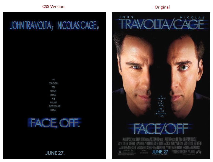
Okay, so let’s assume the Narrator is my Oracle, and this markup is perfect. This poses a challenge for my CSS to still get a resulting visual that resembles the original poster. Here’s the result I settled for (compared to the original):

Face/Off Comparison

I’m not happy with this, as in: I wish I was more succesful in finding hacks to fix the differences. These include:

  • Getting the actor names to spread out on two lines, with the actor’s first names in a smaller font. I’ve tried using “first-line”, but as soon as I decrease the font-size the second word will also fit on the first line. Highly frustrating, I see no simple solution here.
  • Replacing “, ” (comma + space) with a single “/” (slash). I’ve tried several things, including the experimental unicode-range descriptor. No dice.
  • Getting rid of the periods at the end of sentences. Alas, there is no “last-letter” or “nth-letter(…)” pseudo-selector.
  • Finding CSS to fix the horizontally stretched text shadow on the titles. A meager “text-shadow” was as close as I could get.

In short: a failed attempt. Educational, though.

CSS Kata “Citizen Kane”

Given that I’m fine with not blogging for a few months, I might as well also be fine with posting twice in one week! I had some inspiration to work on the second CSS Kata: “Citizen Kane”. Here’s what I decided to do differently this time:

  • Include all the other texts (next to the movie title) as well (as suggested by a friend of mine);
  • Pick low-hanging fruit in making my effort look less shitty (e.g. using Paint.NET to find the correct color codes in the original poster);
  • Use this Kata as an excuse to make an animated gif;

Here’s a comparison of the final result:

Citizen Kane CSS Kata Overview

Pretty darn close! To clarify, the rightmost one is the same as the middle one with an opaque background showing the non-textual elements on the movie poster.

Oh yeah, I mentioned an animated gif, right? I kept track of all the changes I did, here’s my train of thought visualized:

Animation of Citizen Kane CSS Kata

(Animated GIF may not display correctly in RSS feed readers; open image or post directly to view it.)

No cheating was involved: these were the actual steps from zero to final result. Here’s the html I ended up using:

And this is the CSS to get to the end result:

Next up: “Face/Off”. Tomorrow, next week, next month, next year: who knows! Whenever I feel like it. Because blogging should be (mainly) for fun!

CSS Kata “Malcolm X”

Last post I set up five related CSS Katas. The callenge is to recreate a movie poster with just css and minimalistic html. The idea is not to come up with an ultimate and production-ready solution. The idea is to practice, and to think outside the box.

Turns out it takes quite some effort to set aside perfectionism while trying these Kata. Turns out it takes even more effort to publicly post my imperfect attempts. Nonetheless, here goes!

I’ve tried two approaches in reproducing the “Malcolm X” movie poster. Here’s a comparison:

Malcolm X Kata Attempts Overview

What I noticed immediately while practicing: it does in fact challenge you to think about some basic meta stuff. This particular kata had me stumped with one very basic question: “Is the big ‘X’ semantic, or not?”. That is: is it a drawing shaped like an ‘X’, or is it an actual letter ‘X’? So first thing I considered was changing the actual markup to something like this:

Notice the extra “X” as the main div content.

It’s an option, but it’s a bit too much for me though. It would be as if the poster said “Malcolm X, X”. However, you could say that “:after” the h1 tag comes a big “X” as additional graphical content. This led to Version A:

There’s several things I can notice about this:

  • The big X has to be in a certain font. The only widely available font that comes close to the original “X” is the one from “Courier New”, and it’s not all that close. In fact, it looks a lot different.
  • It’s pretty tough to control the width of the lines that make up the X. I’m not at all happy about how the top of the “M” isn’t aligned with the top of the big “X”.
  • Turns out the “Malcolm X” in the original poster is quite dense. I resorted to using css transforms, but I think there’s also some font-stretching css modules (just haven’t looked into that yet).
  • It’s extremely tough to make everything scale nicely. That is, all the various dimensions, font-sizes, paddings, etc. are in absolute pixels. Changing one would mean tweaking all others. I just decided that’s okay for now, allowing me to focus on the other parts of this kata.
  • The screenshot was made in Chrome. In other browsers it’s not right at all. I just chose not to focus on browser differences for now.

My other attempt tries to trade semantics for more pixel-perfectness, or at least explore whether that’s a possible path to take. Here’s the code for Version B:

Here are my notes:

  • It looks a lot more like the original than Version A does. Far from perfect, but this direction looks promising.
  • This version is equally hard-coded: exact dimensions everywhere, all interdependent.
  • There’s some peculiarities about the rotation transforms I haven’t quite grasped yet. For example, the two diagonal bars don’t quite both start equally far from the outer borders.
  • After 15 years of CSS, z-indexes still make my head hurt. I need to practice that seperately some time.

All in all I’m quite pleased. Both my solutions look like shit, but hey: it made me practice! I’ll try to charge up, and may even publicize my epic failures for the second Kata as well.

CSS Katas

In one of the books I read recently I came across Dave Thomas‘ excellent idea of “Code Katas“. These are in essence nothing more than a way to train your programming skills. Small excercises with no real consequence, allowing you to focus on the programming instead of the result.

This idea really stuck with me, even though I don’t do them enough to my taste. I’ve honed my TDD skills with the first 20 Project Euler problems, and sometimes answering a Stack Overflow question may qualify. However, I don’t quite “excercise regularly”.

Regardless of whether it will get me excercising again, I thought it’d be fun to come up with a set of kata myself. So here’s a basic challenge for you (= me?): recreate these titles on movie posters in CSS3. Just the texts of course.

Before we get to the five posters, let’s first lay down the ground rules:

  • CSS3 so modern browsers (IE10+, latest Chrome, FF, Safari). Great if it works in one of em, bonus points if it looks alike across browsers.
  • Fonts is a tricky bit. Google Fonts is okay I guess, but bonus points for sticking with Arial, Verdana, Georgia, Times New roman, etc.
  • Images are out of the question of course.

In addition, or even to extend on these bullets: there are no real “hard and fast” rules. It’s not a competition (even though I personally love treating it as such), it’s an excercise.

Enjoy!

1. Malcolm X

The biopic of the controversial and influential Black Nationalist leader.

Malcolm X movie poster

Here’s the suggested markup to style:

2. Citizen Kane

Following the death of a publishing tycoon, news reporters scramble to discover the meaning of his final utterance.

Citizen Kane movie poster

Here’s the suggested markup to style:

3. Face/Off

Famous actors shoot at eachother.” Or something. Fun title for this excercise though!

Face Off movie poster

Here’s the suggested markup to style:

4. Fight Club

“An insomniac office worker looking for a way to change his life crosses paths with a devil-may-care soap maker and they form an underground fight club that evolves into something much, much more…”

Fight Club movie poster

Here’s the suggested markup to style:

5. The Two Towers

Second movie in the Lord of the Rings trilogy.

The Lord of the Rings: The Two Towers

Here’s the suggested markup to style:

However, I can imagine different “correct” kinds of markup for that data, feel free to tweak accordingly.

70-480 (HTML5 with JavaScript and CSS3) Study Plan

Looking for my exam summary? Jump straight to it! Want to know more? Keep reading…

Last year I published my study plan for the 70-513 Microsoft exam (“study log” would’ve been more appropriate), which helped me pass the exam (without cheating by using brain dumps) with just under 200 hours of study time. This time I’m going for the 70-480 exam (html5, JavaScript, and css3), and I’ve decided to use an actual plan. When I started rolling up this plan, there were a few premises.

First up: the date for my exam is already set. I will probably not be able to spend a full 200 hours on the subject matter before planning my exam. The plan will have to scale with the amount of time I will turn out to have available. Anyways, given that the exam was free of charge, it’s not as big a deal if I don’t pass it.

Secondly, the subject matter for 70-480 is not entirely new to me, as was the case with the 70-513 (WCF) exam. So, my plan would be okay even if it omits more general prose about the subjects and sticks to the details of objectives. I’m not sure how this will affect my chances. I’m hoping my existing knowledge make things easier, but at the same time I’m afraid that it won’t…

Finally, and most imporantly, I figured that reviewing the exam objectives very carefully should be enoughBecause the exam is brand new, there is no official study guide, nor are there any books specifically aimed at the exam. I was hoping to piggyback on someone else’s summary, but given that I couldn’t find any decent one, I decided to create my own.

The Plan

So here are the steps I’m taking to study for this exam:

  1. Create an overview of all exam objectives.
  2. Find links for all objectives (at least one, preferably two or more per objective), from various sources:
    1. The relevant spec.
    2. The W3 wiki, if applicable.
    3. MDN (my personal favorite source for most web development topics).
    4. MSDN (it’s a Microsoft exam, after all).
    5. jQuery (Microsoft’s gambling hard on this library, it seems).
    6. Miscellaneous other sources (DiveIntoHtml5, Stack Overflow, etc)
  3. Review all objectives by reading through the linked pages.

So far I’m pretty happy with the result. If you want to piggyback on my 70-480 summary: be my guest! It looks something like this:

70-480 Study Guide

Creating the list and digging up all the links took a few nights work, all done over the course of the previous two weeks. Next up: two weeks of reviewing these objectives, followed by the exam itself.

Wish me luck!