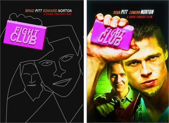
After last kata I’d really had it with CSS-ing “true semantic” markup. So this time I went all out: bend the markup backwards as far as it’d go. And though the html-gods may strike me down, they won’t do so before I’ve created this monster:

I’ve spent 1 minute on a background to match the “feel” of the original poster, and a good 2 hours fiddling on the markup and CSS. The result felt moderately pleasing. I only felt like doing the easy bits, so I left the things I didn’t instantly know a solution to for what they were (the 3D effect on the letters, choosing a better font, etc.).
For reference, here is the monster we’re talking about:
|
1 2 3 4 5 6 7 8 9 10 11 12 13 14 |
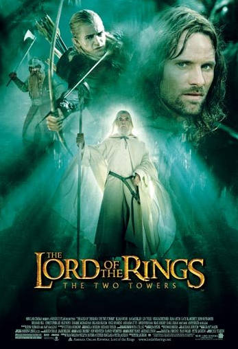
The Lord of the Rings The Two Towers |
So many spans, my eyes! Here’s the corresponding CSS:
|
1 2 3 4 5 6 7 8 9 10 11 12 13 14 15 16 17 18 19 20 21 22 23 24 25 26 27 28 29 30 31 32 33 34 35 36 37 38 39 40 41 42 43 44 45 46 47 48 49 50 51 52 53 54 55 56 57 58 59 60 61 62 63 64 65 66 67 68 69 70 71 72 73 74 75 76 77 78 79 80 81 82 83 84 85 86 87 88 89 90 91 92 93 94 95 96 97 98 99 100 101 102 103 104 105 106 107 108 109 |
@import url(http://fonts.googleapis.com/css?family=Libre+Baskerville); * { text-transform: uppercase; font-weight: normal; } .poster { width: 347px; height: 508px; background-color: #005140; position: relative; background: #f0f9ff; background: -moz-radial-gradient(center, ellipse cover, #f0f9ff 0%, #00897a 25%, #003d36 100%); background: -webkit-gradient(radial, center center, 0px, center center, 100%, color-stop(0%,#f0f9ff), color-stop(25%,#00897a), color-stop(100%,#003d36)); background: -webkit-radial-gradient(center, ellipse cover, #f0f9ff 0%,#00897a 25%,#003d36 100%); background: -o-radial-gradient(center, ellipse cover, #f0f9ff 0%,#00897a 25%,#003d36 100%); background: -ms-radial-gradient(center, ellipse cover, #f0f9ff 0%,#00897a 25%,#003d36 100%); background: radial-gradient(ellipse at center, #f0f9ff 0%,#00897a 25%,#003d36 100%); filter: progid:DXImageTransform.Microsoft.gradient( startColorstr='#f0f9ff', endColorstr='#003d36',GradientType=1 ); } h1 { color: gold; position: absolute; left: 0; bottom: 88px; font-size: 12px; letter-spacing: -1.5px; text-shadow: 3px 3px 3px #002823, -1px 0 3px #002823; font-family: 'Libre Baskerville', serif; } h1 > span { display: inline-block; font-size: 32px; *border: 1px solid red; } #the1 { font-size: 10px; position: relative; left: 70px; top: -28px; } #l { display: inline-block; font-size: 60px; position: relative; left: 22px; top: 14px; transform : scale(0.7,1.2); -webkit-transform:scale(0.7,1.2); /* Safari and Chrome */ -moz-transform:scale(0.7,1.2); /* Firefox */ -ms-transform:scale(0.7,1.2); /* IE 9+ */ -o-transform:scale(0.7,1.2); /* Opera */ } #ofthe { display: inline-block; width: 36px; text-align: center; line-height: 0.95em; font-size: 14px; position: relative; left: 0; } #r { font-size: 46px; position: relative; top: 6px; left: 6px; } #i { position: relative; top: 2px; } #g { position: relative; left: -3px; } #s { font-size: 60px; position: relative; top: 20px; left: -6px; } #rings { position: relative; left: -10px; } h2 { position: absolute; left: 96px; bottom: 82px; font-size: 9px; letter-spacing: 5px; font-family: Arial; color: #F6FFA8; text-shadow: 1px 1px 1px rgba(0, 0, 0, 0.5); } |
See it in action on JSBIN.
This concludes my self-imposed challenge of CSS katas. Even though these katas (or the fact that I insisted on publicizing them) were probably not “lightweight” enough, the basic principle of doing katas was enjoyable. Perhaps I should secretly start another series…