From my previous blogpost I learned that combining WordPress, the rowspan attribute, and Feedly will result in a Picasso-like rendering of your post. This blog doesn’t have “Meta” in its title, and that’s not for nothing. So let’s examine this beast.
Here’s the markup:
|
1 2 3 4 5 6 7 8 9 10 11 12 13 |
|
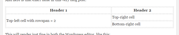
And here is that exact table in this very blog post:
| Header 1 | Header 2 |
|---|---|
| Top-left cell with rowspan = 2 | Top-right cell |
| Bottom-right cell |
This will render just fine in both the WordPress editor, like this:
And it will also render just fine in WordPress itself, like this:

You can check out how this rendered in Feedly by visiting the actual website for this blog:

Which is ugly, but technically just fine! (It’s only missing or ignoring the full-width css attribute.)
So, what went wrong with my previous post? In case you wouldn’t believe me (but you do, don’t you?!), here’s an annottated rendering of that post in Feedly:
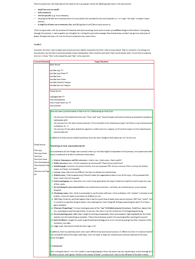
Basically, the green bit should’ve come below the table, but instead it got lumped into the bottom right cell. If I check the rendered html in Feedly using the Chrome dev tools, I can see that it does indeed do this.
I’ve checked in my RSS feed and found the culprit, it’s actually WordPress that renders faulty html:
|
1 2 3 4 5 6 |
There’s a rogue Lesson learned: be wary of how WordPress will render your post. :-) Finishing TimeLineOh my, that code… where to begin!? Before you read on, perhaps you should have a 30 sec look at what I’m talking about. I’ll wait here, go ahead! … Current thoughts about this projectTimeLine’s at prototype status, but hopefully it’s clear what the app was meant for: visualizing experience over time, using grouped, parallel timelines. I look back at this mini-project, and directly notice a few things. First and foremost: I still like the idea of such an app! Visualizing work experience is great for a résumé I think, it allows the reader to instantly get a “feel” for what you’ve been working on. Much better than dreary text. The second thing I realize is that I clearly had no idea and/or time to quickly scaffold an editor (“yes”, I thus resorted to using a The final thing I realized: it’s a decent prototype, and to get there I sacrificed a lot of code quality. With 140 SLOC it’s not much code, but what’s there is rather bad. Finishing thingsThis leaves me a bit in a tight spot. What am I to do with this project? First I thought about deleting the thing entirely, praying no one would ever find out about the JavaScrippaghetti I had unleashed on the world. Then again, that would be silly: everyone needs to write a fair share of bad code to get better at writing code. My second thought was to rewrite the thing from scratch: right here, right now. Nearly started working on it too. Guess I wasn’t lying when I said I still like the idea. Then again, that would be silly: I still have two other projects left to “wrap up”, one of which is much more deserving of my time. My third and final thought was to wrap up by doing a loose “code review” of my own code. In addition it feels good to “stamp” it with a disclaimer and message that it’s “wrapped up”. And that actually seems like the best idea. Code reviewThe html is not really worth going through. It’s a plain html-reset-based file, that uses semantic markup ( Let’s dive into that one code file. It’s starts off with some good signs:
Apparently the code’s being linted with a more sane version of Crockford’s jslint, and the code declares ES5 “strict mode”. Guess the author did forget to run the linter recently, because currently it seems to still cause a few errors. Anyways, moving on we see:
Not exactly globals, but a definite hint the author’s struggling with JavaScript closures. Except for Moving on the code follows a typical jQuery plugin template, first with all the plugin’s methods defined within a seperate closure, then at the end of the file exported in a typical fashion:
What you can already see here though is that the plugin relies on one single god method:
Phew, at least the author realized the code could not go on like this for much longer. This is further clarified by the presence of this kind of code (abbreviated):
Yikes! The Let’s finish on a positive note though, having a look at some of the variable names in use:
This makes me smile. Having the UI of the app in mind I instantly know what these mean. A segment is one piece of timeline, a lane is a horizontal area where segments can be placed, and a catgory highway is a set of lanes for segments from one category. Close-reading the code I find this is in fact mostly correct. And with that I feel there’s a great OO (or more prototypical) way to reboot the code for this app. In ConclusionIn conclusion, or perhaps more appropriately “in summary”, I can say this is a fine and above-all inspiring prototype. The code’s short and bad, but not even that bad for a quick prototype. With a proper disclaimer and “wrap up” message I feel can safely leave TimeLine be for now. Perhaps one day I’ll revisit it. CSS Kata “The Lord of the Rings”After last kata I’d really had it with CSS-ing “true semantic” markup. So this time I went all out: bend the markup backwards as far as it’d go. And though the html-gods may strike me down, they won’t do so before I’ve created this monster:
I’ve spent 1 minute on a background to match the “feel” of the original poster, and a good 2 hours fiddling on the markup and CSS. The result felt moderately pleasing. I only felt like doing the easy bits, so I left the things I didn’t instantly know a solution to for what they were (the 3D effect on the letters, choosing a better font, etc.). For reference, here is the monster we’re talking about:
So many spans, my eyes! Here’s the corresponding CSS:
See it in action on JSBIN. This concludes my self-imposed challenge of CSS katas. Even though these katas (or the fact that I insisted on publicizing them) were probably not “lightweight” enough, the basic principle of doing katas was enjoyable. Perhaps I should secretly start another series… 70-480 (HTML5 with JavaScript and CSS3) Study PlanLooking for my exam summary? Jump straight to it! Want to know more? Keep reading… Last year I published my study plan for the 70-513 Microsoft exam (“study log” would’ve been more appropriate), which helped me pass the exam (without cheating by using brain dumps) with just under 200 hours of study time. This time I’m going for the 70-480 exam (html5, JavaScript, and css3), and I’ve decided to use an actual plan. When I started rolling up this plan, there were a few premises. First up: the date for my exam is already set. I will probably not be able to spend a full 200 hours on the subject matter before planning my exam. The plan will have to scale with the amount of time I will turn out to have available. Anyways, given that the exam was free of charge, it’s not as big a deal if I don’t pass it. Secondly, the subject matter for 70-480 is not entirely new to me, as was the case with the 70-513 (WCF) exam. So, my plan would be okay even if it omits more general prose about the subjects and sticks to the details of objectives. I’m not sure how this will affect my chances. I’m hoping my existing knowledge make things easier, but at the same time I’m afraid that it won’t… Finally, and most imporantly, I figured that reviewing the exam objectives very carefully should be enough. Because the exam is brand new, there is no official study guide, nor are there any books specifically aimed at the exam. I was hoping to piggyback on someone else’s summary, but given that I couldn’t find any decent one, I decided to create my own. The PlanSo here are the steps I’m taking to study for this exam:
So far I’m pretty happy with the result. If you want to piggyback on my 70-480 summary: be my guest! It looks something like this:
Creating the list and digging up all the links took a few nights work, all done over the course of the previous two weeks. Next up: two weeks of reviewing these objectives, followed by the exam itself. Wish me luck! CSS syntax naming conventionsMy next Stack Exchange Challenge post will most likely be about the Programmers SE. One part of the challenge is to actually ask a question I have on the topic. The question I came up with (to be honest, this has been bothering me for months now) took quite some time to write down carefully. So, as I don’t have my next SE Challenge post ready yet, I decided to cross-post my question here on my blog as well. The Question: what are the practical considerations for the syntax in Note that I’m not asking about the semantics, i.e. the actual words that are being used, as for example described in this blogpost. There are a lot of resources on that side of naming conventions already, in fact obscuring my search for practical information on the various syntactical bits: casing, use of interpunction (specifically the To sum up the reasons I’m asking this question:
Some of the conventions I’ve considered using: 
And probably I’ve left out some important options or combinations as well. So: what considerations are there for naming conventions, and to which convention do they lead? CSS first-letter drop capsA little while ago this interesting Stack Overflow question caught my attention. The question is about drop caps: a typographical gimmick where the first letter of a paragraph is very big and prominent. In older texts this could be even more than “prominent”, for example this page from an old Dutch Bible:  Of course, the CSS pseudo-selector :first-letter seems perfect to achieve this effect on the web. The question on Stack Overflow used that as a starting point, and is about a particular situation where IE wouldn’t render correctly. While trying to find a solution to that particular problem I found out things were not so simple, and posted this answer. The answer basically came down to “no way to get it right in all browsers”. With rather “standard” CSS rules, various browsers gave varying results:  Not very satisfying at all! After thinking about this some more, I decided to try and at least get a “minimal” example of drop caps working in all current browsers. To keep things “minimal” my first try will:
It took some time, but I did come up with decent results. You can show the example html file on my blog, or view it as a jsfiddle. The example contains a reset style and some coloring so you can see the results clearly. However, the nitty gritty is in this bit of CSS:
This actually gives acceptable and mostly consistent results. Here’s a screenshot of how this renders in up to date versions of my browsers (all on Windows 7):     Great! However, one browser is still not playing nice. No, not everyone’s “favorite” browser IE is acting weird, but Firefox is! Have a closer look at the left (:first-letter) rendering in Firefox: the height of the drop cap isn’t what we want it to be. However, some searching on Google leads to a related Stack Overflow question as well as this question, ultimately leading me to a bug from 2007 in Firefox. Guess it can’t be done easily then. End of the road? Perhaps. But perhaps also a great opportunity to try and create a jQuery plugin that creates drop caps… Re-discovering JavaScriptAround 1995 I started creating web pages. HTML was my friend, and analogous to the story of Adam and Eve, a companion called CSS was created. I considered HTML to be the robust male of the relationship, and CSS giving the beautiful female touch to my web pages. Then Darkness came. A brand new player invaded my perfect little web world and tried to make it into a love triangle. Enter JavaScript. At first this new technique looked awesome to me. I knew Turbo C++ 3.0 (with a nice DOS look and feel) as well as Visual Basic, and was eager to add some dynamic features to my web pages. Oh how I underestimated the complexity. I knew no patterns, none of my code had ever been reviewed by others, and I tried to figure out everything with trial and error. Plus: I didn’t understand the DOM at all. So I ended up writing stuff like this:
The above snippet must have cost me a week to figure out. I was so frustrated I wanted to ban JavaScript from my pages as much as possible, which is exactly what I did when I learned to use Perl to add dynamic features to web sites. More than a decade passed, but Darkness was still looming. I tried to stay in the Light with my happy couple HTML and CSS (only tolerating incidental guest appearances by JavaScript). I even turned to WinForms programming in .NET so I wouldn’t have to face the Darkness. But then my ASP.NET days came, and it turned out: JavaScript was here to stay. However, my second encounter with JavaScript was mediated by jQuery, which had powers rivaling those of Dr. Phil himself. That library makes JavaScript feel like the love child of HTML and CSS, with a dynamic twist. And so, JavaScript is getting a second chance. Any leftover JavaScript frustrations were explained in this presentation: I started to use JavaScript without ever learning it. So I picked up the corresponding book by Douglas Crockford, which shall be followed by The Definitive Guide. Hopefully this will allow me to Learn to Stop Worrying and Love the Bomb. Foot note: at the time of writing, the piece of JavaScript code in this post is still running in production, in a Web Shop created in the 90’s, using Perl 5, HTML4, CSS2, and a hint of JavaScript… |

