Here’s the slogan for today’s Kata:
Commas: use them bitches!
Or in general: interpunction is important. Turns out with this poster that even certain content (e.g. slashes) may not be content after all, but just styling.
First things first though. For the Face/Off Kata the first thing I did was to get the text in there, with only a wee bit of styling to get going. This is the markup:
|
1 2 3 4 5 6 7 8 9 10 11 |
John Travolta Nicolas Cage In order to trap him, he must become him Face/Off June 27 |
And this is the CSS:
|
1 2 3 4 5 6 7 |
.poster { background-color: black; color: #88F; width: 350px; height: 500px; text-align: center; } |
For some reason I did place a “/” in the movie title, yet not between the actor’s names, even though it was clearly there in the original poster. This is probably a problem, that can be discovered by imagining how a screen reader would go about this text. Basically, the Windows Narrator tells me this:
John Travolta Nicolas Cage in order to trap him, he must become him Face slash Off June 27nd
Not good. I’ve tried to improve my markup into this, using commas and other important interpunction:
|
1 2 3 4 5 6 7 8 9 10 |
John Travolta, Nicolas Cage. In order to trap him, he must become him. Face, Off. June 27. |
This is much, much better. It is read by Narrator like this:
John Travolta, Nicolas Cage. In order to trap him, he must become him. Face, off. June 27nd.
Okay, so let’s assume the Narrator is my Oracle, and this markup is perfect. This poses a challenge for my CSS to still get a resulting visual that resembles the original poster. Here’s the result I settled for (compared to the original):
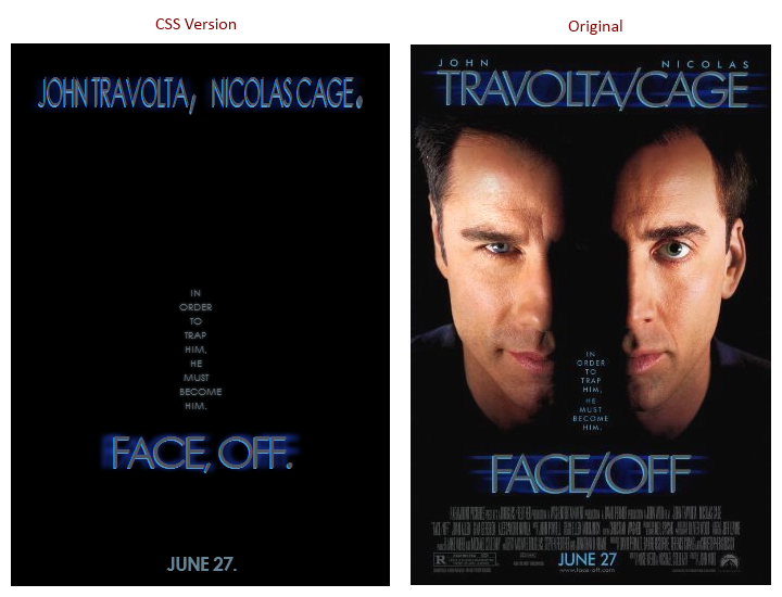
I’m not happy with this, as in: I wish I was more succesful in finding hacks to fix the differences. These include:
- Getting the actor names to spread out on two lines, with the actor’s first names in a smaller font. I’ve tried using “first-line”, but as soon as I decrease the font-size the second word will also fit on the first line. Highly frustrating, I see no simple solution here.
- Replacing “, ” (comma + space) with a single “/” (slash). I’ve tried several things, including the experimental unicode-range descriptor. No dice.
- Getting rid of the periods at the end of sentences. Alas, there is no “last-letter” or “nth-letter(…)” pseudo-selector.
- Finding CSS to fix the horizontally stretched text shadow on the titles. A meager “text-shadow” was as close as I could get.
In short: a failed attempt. Educational, though.