CSS Kata “Face/Off”

Here’s the slogan for today’s Kata:

Commas: use them bitches!

Or in general: interpunction is important. Turns out with this poster that even certain content (e.g. slashes) may not be content after all, but just styling.

First things first though. For the Face/Off Kata the first thing I did was to get the text in there, with only a wee bit of styling to get going. This is the markup:

And this is the CSS:

For some reason I did place a “/” in the movie title, yet not between the actor’s names, even though it was clearly there in the original poster. This is probably a problem, that can be discovered by imagining how a screen reader would go about this text. Basically, the Windows Narrator tells me this:

John Travolta Nicolas Cage in order to trap him, he must become him Face slash Off June 27nd

Not good. I’ve tried to improve my markup into this, using commas and other important interpunction:

This is much, much better. It is read by Narrator like this:

John Travolta, Nicolas Cage. In order to trap him, he must become him. Face, off. June 27nd.

Okay, so let’s assume the Narrator is my Oracle, and this markup is perfect. This poses a challenge for my CSS to still get a resulting visual that resembles the original poster. Here’s the result I settled for (compared to the original):

Face/Off Comparison

I’m not happy with this, as in: I wish I was more succesful in finding hacks to fix the differences. These include:

  • Getting the actor names to spread out on two lines, with the actor’s first names in a smaller font. I’ve tried using “first-line”, but as soon as I decrease the font-size the second word will also fit on the first line. Highly frustrating, I see no simple solution here.
  • Replacing “, ” (comma + space) with a single “/” (slash). I’ve tried several things, including the experimental unicode-range descriptor. No dice.
  • Getting rid of the periods at the end of sentences. Alas, there is no “last-letter” or “nth-letter(…)” pseudo-selector.
  • Finding CSS to fix the horizontally stretched text shadow on the titles. A meager “text-shadow” was as close as I could get.

In short: a failed attempt. Educational, though.

Pretty Database Diagrams

This is a cross-post about database diagrams, originally a self-answered question on the new Software Recommendations Stack Exchange site.


Up until a few years ago I used Microsoft Visio to reverse engineer an existing database to a diagram. This feature has been deprecated for a while now, and I’m rather stuck in finding an alternative.

Requirements

So, what would be the requirements for an alternative? Most of the requirements below were in Visio, though not all of them. I guess finding one piece of software that has them all is not feasible, but I’d like to get close.

Important:
  • SQL Server 2012 databases;
  • Reverse engineer tables with all columns and Primary/Foreign Key indications;
  • Reverse engineer foreign keys as connectors between tables;
  • Manual layouting of boxes and connectors (I want to group stuff visually);
  • Basic theming: choose background colors for tables;
  • Able to handle complex models, e.g. 100+ tables;
  • Able to choose which items to show or not (e.g. leave out certain tables, etc);
  • At least a free trial available;
  • Exporting to various formats for distributing and printing purposes, PDF, or PNG would also do;
  • WYSIWYG;
Main bonus points:
  • Runs on Windows 8 (though I’d install a Linux VM for software fulfilling all important requirements)
  • Automatic layouting and connector routing to minimize overlap;
  • Able to do SQL Server 2008 and 2008R2;
  • Able to reverse engineer views;
  • Free (or a free version);
  • Incremental update, e.g. reverse engineer again and have tables added/removed, etc., whilst keeping theme, existing layout, etc.
  • Pretty diagrams (modern look and feel, anti-aliasing, choice of fonts, colors, gradients, drop shadows, theming, etc);
  • Friendly learning curve (I can handle many complex features as long as it’s easy to get the basics done quickly);
MUST HAVE:
  • Installer doesn’t secretly install toolbars in my browser or change my home page!

My Research

Of course this question has been asked before, even on sister sites (with some success even though they’re off topic there). Here’s a few:

And slightly similar, from DBA.SE:

Furthermore, Wikipedia has a table comparing several software packages for “reverse engineering” feature:

Tried

These are the things I’ve tried:

  • Visio 2003 (this is what I used to use). Not free, outdated, but otherwise it fit the bill for most points. Not an option anymore though.
  • Visio 2010 and 2013 (this is what I have currently). Reverse engineering is no longer supported. I’ve considered writing a plugin or using VBA to hack things together though. Not sure how tough that would be. It’s not free (except I guess that I personally have it already), but fits the bill on a lot of other points.
  • Graphviz. Tried this quite some time ago, from what I remember it had a bit steep learning curve and I wasn’t quite able to manually determine final layout.
  • SSMS diagrams. This works for small cases, but can be cumbersome for larger cases.
  • Visual Studio 2012 ADO.NET Entity Data Model. Manual layouting of connectors is limited, theming does not exist at all, it is really meant for a goal other than documentation and it shows (e.g. default you get “Navigation Properties”, etc), and it doesn’t work well for 100+ tables. This may be useful for smaller scenario’s but doesn’t fit the bill for me.

And I think I may have tried a few suggestions from the SO threads, though I can’t really remember specifics.

So I asked: what would others recommend?

…Radio silence…

So I guess I’ll have to answer my own question then. My suggestion:

Use plain Visio for this.

Here’s why.

Explanation of my approach

There is no tool that conveniently satisfies all mentioned requirements, not even one that fulfills the main requirements only. Visual Studio 2012 comes close, but lacks theming support and didn’t work very well for a large number of tables.

The following process worked for me:

  1. Create a blank Visio Flowchart template. I’ve also tried the UML template and shapes but this has infuriating behavior for connector routing. Not recommended! Choose a design you like. Set the page and print sizes to something you want (I chose landscape A3 format and the “Linear” theme).
  2. Open a query in SSMS on the side to get the details you’ll need later: tables, column names, and IS NULL info.

  1. Start adding the tables one by one. Choose manually which tables and columns you which to include.

This is an example of what the end result looks like:

Database Diagram Example (Zoomed In)

Or a zoomed out screenshot of the entire model (because it was manual labor I chose to include significantly less than all 100+ tables):

Database Diagram Example (Zoomed Out)

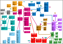
The procedure I used to make the “tables” look as they do:

  • Headers are bold and a larger font size.
  • Separators aren’t lines but just a series of bold “—” dashes after eachother.
  • Four “sections”: TableName, Primary Key, Foreign Keys, plain columns.
  • Bold for NOT NULL columns.
  • White for TableName and separators, black for column names.

In addition, I chose for foreign keys to:

  • Never allow crossing connectors, and instead creating small “reference” blocks that refer to a table that’s somewhere on the other side of the model.
  • Not include all tables (i.e. there are more foreign keys than connectors).

Hopefully the above will be of use to others too.

How it holds up to the requirements

As a bottom line, I do recommend this approach, mainly because you end up with a visually appealing model and a high degree of control. This approach doesn’t fit the entire bill though. Here’s how it holds up to the requirements:

Data connectivity
  • SQL Server 2012 databases
  • Reverse engineer tables with all columns and Primary/Foreign Key indications
  • Reverse engineer foreign keys as connectors between tables

± This is all possible but not automated. So “more or less”.

Control and visuals
  • Manual layouting, basic theming, able to choose which items to show
  • Able to handle complex models, e.g. 100+ tables

✓ Yes, this all works very well with plain Visio.

Moneys
  • At least a free trial available

✓ AFAIK there’s a free Office trial available. I haven’t looked into this though as I have Visio.

Other
  • Exporting to various formats
  • WYSIWYG;

✓ Yes, this is available in Visio.

Bonus Points

It has about half of the bonus points:

  • runs on Windows 8
  • SQL 2008 also supported
  • pretty
  • friendly learning curve

Conclusion

It’s a shame I didn’t find any tool that met my requirements. I actually feel like failing in this regard: surely I haven’t looked hard enough?

It’s also a shame that I wasn’t able to muster the perseverance to automate this. I’m a developer for fuck’s sake!? (Or am I?)

It’s without shame though that I did end up with a rather pretty, useful diagram, with exactly the layout and content I wanted. I guess “Good is the enemy of Perfect” held up here.

CSS Kata “Citizen Kane”

Given that I’m fine with not blogging for a few months, I might as well also be fine with posting twice in one week! I had some inspiration to work on the second CSS Kata: “Citizen Kane”. Here’s what I decided to do differently this time:

  • Include all the other texts (next to the movie title) as well (as suggested by a friend of mine);
  • Pick low-hanging fruit in making my effort look less shitty (e.g. using Paint.NET to find the correct color codes in the original poster);
  • Use this Kata as an excuse to make an animated gif;

Here’s a comparison of the final result:

Citizen Kane CSS Kata Overview

Pretty darn close! To clarify, the rightmost one is the same as the middle one with an opaque background showing the non-textual elements on the movie poster.

Oh yeah, I mentioned an animated gif, right? I kept track of all the changes I did, here’s my train of thought visualized:

Animation of Citizen Kane CSS Kata

(Animated GIF may not display correctly in RSS feed readers; open image or post directly to view it.)

No cheating was involved: these were the actual steps from zero to final result. Here’s the html I ended up using:

And this is the CSS to get to the end result:

Next up: “Face/Off”. Tomorrow, next week, next month, next year: who knows! Whenever I feel like it. Because blogging should be (mainly) for fun!

CSS Kata “Malcolm X”

Last post I set up five related CSS Katas. The callenge is to recreate a movie poster with just css and minimalistic html. The idea is not to come up with an ultimate and production-ready solution. The idea is to practice, and to think outside the box.

Turns out it takes quite some effort to set aside perfectionism while trying these Kata. Turns out it takes even more effort to publicly post my imperfect attempts. Nonetheless, here goes!

I’ve tried two approaches in reproducing the “Malcolm X” movie poster. Here’s a comparison:

Malcolm X Kata Attempts Overview

What I noticed immediately while practicing: it does in fact challenge you to think about some basic meta stuff. This particular kata had me stumped with one very basic question: “Is the big ‘X’ semantic, or not?”. That is: is it a drawing shaped like an ‘X’, or is it an actual letter ‘X’? So first thing I considered was changing the actual markup to something like this:

Notice the extra “X” as the main div content.

It’s an option, but it’s a bit too much for me though. It would be as if the poster said “Malcolm X, X”. However, you could say that “:after” the h1 tag comes a big “X” as additional graphical content. This led to Version A:

There’s several things I can notice about this:

  • The big X has to be in a certain font. The only widely available font that comes close to the original “X” is the one from “Courier New”, and it’s not all that close. In fact, it looks a lot different.
  • It’s pretty tough to control the width of the lines that make up the X. I’m not at all happy about how the top of the “M” isn’t aligned with the top of the big “X”.
  • Turns out the “Malcolm X” in the original poster is quite dense. I resorted to using css transforms, but I think there’s also some font-stretching css modules (just haven’t looked into that yet).
  • It’s extremely tough to make everything scale nicely. That is, all the various dimensions, font-sizes, paddings, etc. are in absolute pixels. Changing one would mean tweaking all others. I just decided that’s okay for now, allowing me to focus on the other parts of this kata.
  • The screenshot was made in Chrome. In other browsers it’s not right at all. I just chose not to focus on browser differences for now.

My other attempt tries to trade semantics for more pixel-perfectness, or at least explore whether that’s a possible path to take. Here’s the code for Version B:

Here are my notes:

  • It looks a lot more like the original than Version A does. Far from perfect, but this direction looks promising.
  • This version is equally hard-coded: exact dimensions everywhere, all interdependent.
  • There’s some peculiarities about the rotation transforms I haven’t quite grasped yet. For example, the two diagonal bars don’t quite both start equally far from the outer borders.
  • After 15 years of CSS, z-indexes still make my head hurt. I need to practice that seperately some time.

All in all I’m quite pleased. Both my solutions look like shit, but hey: it made me practice! I’ll try to charge up, and may even publicize my epic failures for the second Kata as well.

CSS Katas

In one of the books I read recently I came across Dave Thomas‘ excellent idea of “Code Katas“. These are in essence nothing more than a way to train your programming skills. Small excercises with no real consequence, allowing you to focus on the programming instead of the result.

This idea really stuck with me, even though I don’t do them enough to my taste. I’ve honed my TDD skills with the first 20 Project Euler problems, and sometimes answering a Stack Overflow question may qualify. However, I don’t quite “excercise regularly”.

Regardless of whether it will get me excercising again, I thought it’d be fun to come up with a set of kata myself. So here’s a basic challenge for you (= me?): recreate these titles on movie posters in CSS3. Just the texts of course.

Before we get to the five posters, let’s first lay down the ground rules:

  • CSS3 so modern browsers (IE10+, latest Chrome, FF, Safari). Great if it works in one of em, bonus points if it looks alike across browsers.
  • Fonts is a tricky bit. Google Fonts is okay I guess, but bonus points for sticking with Arial, Verdana, Georgia, Times New roman, etc.
  • Images are out of the question of course.

In addition, or even to extend on these bullets: there are no real “hard and fast” rules. It’s not a competition (even though I personally love treating it as such), it’s an excercise.

Enjoy!

1. Malcolm X

The biopic of the controversial and influential Black Nationalist leader.

Malcolm X movie poster

Here’s the suggested markup to style:

2. Citizen Kane

Following the death of a publishing tycoon, news reporters scramble to discover the meaning of his final utterance.

Citizen Kane movie poster

Here’s the suggested markup to style:

3. Face/Off

Famous actors shoot at eachother.” Or something. Fun title for this excercise though!

Face Off movie poster

Here’s the suggested markup to style:

4. Fight Club

“An insomniac office worker looking for a way to change his life crosses paths with a devil-may-care soap maker and they form an underground fight club that evolves into something much, much more…”

Fight Club movie poster

Here’s the suggested markup to style:

5. The Two Towers

Second movie in the Lord of the Rings trilogy.

The Lord of the Rings: The Two Towers

Here’s the suggested markup to style:

However, I can imagine different “correct” kinds of markup for that data, feel free to tweak accordingly.

Stack Exchange Challenge: Full-time

I’ve finished my self-imposed Stack Exchange challenge. What a great feeling: finishing things. Only one thing left on my to do list: create a small epilogue. And this is it.

The epilogue is going to be short, using the same format as the half-time post: a wrap up with links to all the bits of this series.

  1. Episode 1: Cooking Stack Exchange Challenge (March 20th, 2012)
  2. Episode 2: Programming Stack Exchange Challenge (April 2nd, 2012)
  3. Episode 3: Gaming Stack Exchange Challenge (May 14th, 2012)
  4. Episode 4: Android Stack Exchange Challenge (June 20th, 2012)
  5. Episode 5: User Experience Stack Exchange Challenge (September 9th, 2012)
  6. Episode 6: DBA Stack Exchange Challenge (October 8th, 2012)
  1. Episode 7: Area 51 Stack Exchange Challenge (May 13th, 2013)
  2. Episode 8: Area 51 Discuss Stack Exchange Challenge (June 30th, 2013)
  3. Episode 9: Meta Stack Overflow Stack Exchange Challenge (August 12th, 2013)
  4. Episode 10: Stack Overflow Stack Exchange Challenge (September 11th, 2013)

And that’s all I have to say about that. Time for a new challenge?

All roads lead to Excel, even those from SQL

My first employer provided me with some valuable insight:

Microsoft Excel is the main competition for any piece of software.

Over the years this statement has proven true an alarming number of times. And it makes sense too. Everyone knows how to use Excel, and it’s extremely flexible, especially when you’re working with any kind of (tabular) data. In other words: all roads lead to Excel.

Roads from SQL also often lead to Excel, even though they’re not always pretty. Sure, if you’re on foot or horseback, with a limited amount of luggage, the road will be fine. However, here’s a particular scenario that obscures the path.

Scenario

These are the basic constraints:

  • Available tools: MSSQL 2012, SSRS, SSIS, Visual Studio 2012 & .NET 4.5.
  • Excel versions: either XLS (2003 and below) or XLSX (2007 and up, slightly preferred) will do.
  • Form of data: combination of normalized and denormalized data (see below).
  • Amount of data: tops 250.000 rows (times 20 when unpivoted).
  • Required response time: live exports that should run within seconds.
  • Databases: many instances each with the exact same schema but different data.

So there’s access to the latest and greatest Microsoft tools, and the option to include custom components. Free and open source components are preferred, but buying tools and components is also an option.

Data

Here’s a simplified version of how the data is modeled:

  • Person is a “flat” table, containing some columns that have “fixed” personal details.
  • Property and Value allow for custom (normalized) Person fields.

Here’s a visual of this simplified model:

Database model for Person, Property, and Value


You can view the SqlFiddle with some sample data. A typical query to get the data that’s going to be our starting point:

This will give output similar to this:

Id FirstName Surname Id PropName Id ValName CustomValue
1 John Doe 1 Trait 2 Bold NULL
1 John Doe 1 Trait 3 Easygoing NULL
1 John Doe 2 Eye color 4 Green NULL
1 John Doe 3 Pet name 7 Placeholder Fluffybunny
2 Mark Roe 1 Trait 3 Easygoing NULL
3 Mary Fisch 2 Eye color 6 Other… Red-brown-ish
3 Mary Fisch 3 Pet name 7 Placeholder Ravi

Note that in reality I’m dealing with these figures:

  • About 30 columns on the Person table;
  • About 20 different Properties with about 6 possible Values on average;
  • Anywhere between 100 and 250.000 Persons;
  • Usually between 0 and 2 Values per Person per Property;

For one, this means that the normal output of mentioned query has a lot of redundant information (i.e. the 30-ish Person columns).

Target Output

The business requirement here when moving this data to Excel should be obvious: the data should be pivoted. Each “Property” should become a group of columns, with one column per “Value”. A table says more than a thousand words; this is the requested output:

Trait Eye Color Pet name
Id FirstName Surname Bold Easygoing Green Other… Placeholder
1 John Doe x x x Fluffybunny
2 Mark Roe x
3 Mary Fisch Red-brown-ish Ravi

Something along these lines is what the business user’s would like to see.

Bonus Objectives

Getting the target output in itself is a challenge. I’m not done yet though, here are some bonus objectives we have (with MoSCoW indications):

  • Properties and Values both have ordering, the order of columns Should respect that.
  • Any solution Should allow for some styling (fonts, borders, backgrounds. It’d be Nice to have further control, for example enable a theme, alternate row coloring, etc.
  • I Would like to have a place for metadata (date exported, etc) somewhere in the generated file.
  • Localization of the column headers (where applicable) would be Nice to have.
  • It’d be Nice to be able to reuse much of the solution in generating XML files instead of Excel sheets.
  • Any solution Must be solid and maintainable.
  • Any solution Must run on moderate hardware without hogging resources.

Current Solution

Right now, the above is accomplished using Reporting Services. This works decently well for datasets containing no more than a few thousand Person rows with related Property Values.

However, beyond about 3000 records performance quickly starts to degrade. This isn’t entirely unexpected, because Reporting Services isn’t really meant for this task (it’s much better at showing aggregates than at exporting large volumes of data).

Possible Solutions

There are many possible solutions. I’m currently considering a subset of them (some solutions merely for “benchmark” purposes):

  • SSIS packages. The tool seems meant for the job. I do hold a grudge against the tool, but maybe it’s time to get over that.
  • Dynamic SQL + generated RDLs. Use DynSQL to do the pivoting. This requires generated RDL files because the fields of a query must be known up fron to SSRS.
  • Dynamic SQL + OPENROWSET + OleDB. Use DynSQL to do the pivoting, and export it straight to Excel using OleDB.
  • FOR XML queries into OpenXML. The basic idea: fast FOR XML queries, possibly an XSLT, generating OpenXML data, and plug it in a basic XLSX.
  • ORM or ADO.NET into an OpenXML using an XmlWriter. Something along these lines.
  • BCP directly into Excel files. Haven’t looked into this yet, but it may be an option.
  • SQL CLR. Not sure how this would work (if at all), but there might be options here.

Now it’s time for me to try some of them, see which one fits the requirements best.

Episode 10: Stack Overflow Stack Exchange Challenge

So here it is, the final episode of the self-imposed Stack Exchange Challenge, detailing my journey through the network of Stack Exchange sites. It is the site I first got involved in, and also the site where I’m most active.

With this final episode it’s time to dig into the meaty bits of the network.

What is Stack Overflow?

Stack Overflow is the brainchild of IT guru’s Joel Spolsky and Jeff “CodingHorror” Atwood. They created it in 2008, and since then it has pushed just about everybody from search results for any typical programming question (well, except for w3fools perhaps). It is a community-driven site where you can ask and answer programming questions, but with a few twists:

  • A hint of Wikipedia: editing your own and other’s questions and answers to improve them;
  • A dose of gamification and Reddit: voting for questions and answers, reputation and badges to be earned, etc;

Only after its overwhelming success did the creators decide to use the engine for other topics as well, some of which I’ve discussed in previous episodes.

So basically Stack Overflow is the first and the biggest site in the network. Time to get to it.

Current Statistics

Here are the stats for Stack Overflow:

Fact Stack Overflow
Questions 5,678,329
Questions with no upvoted answers 1,275,254 (22.46%)
FAQ (questions with most links) 580,632
Top 3 questions 5593 votes, 3576 votes, 3345 votes
Questions active last hour 900
All-time rep for top 3 users 602.6k, 460.7k, 418.9k
Meta questions 18,960

Wow! Truly the biggest site.

My Questions

I’ve asked many more question than those showing on my profile page. However, with programming, you often find the answer yourself while asking. If the answer makes the question look silly, I don’t post it (though if it’s worth answering I document it anyways). From my questions, here’s a few that are interesting:

The ticker’s at 19 currently, versus 377 answers. I think that’s the ratio I’ll probably stick at.

My Answers

I’ve answered a total of 377 questions, and counting. Some that stand out:

Looking back at my answers, I seem to shun the blockbusters, and stick to helping with smaller and more individual questions. But that’s okay. Answering is my form of kata’s.

Interesting questions

Oh dear. I’ve seen too many interesting questions, really. Some are great but not really a good fit for Stack Overflow, like “Strangest language feature“, or “using tables for layout“. One typical question (on parsing HTML with regexes) has an epic answer spawning the “Tony the pony, he comes” meme.

Just browse the questions-by-votes or even closed-questions-by-votes for a few interesting reads.

Conclusion

This is a great site. It was the start of a great network of sites (even though not every site in the network works equally well). But hey, preaching to the choir probably: if you’re a programmer there’s no way around Stack Overflow anymore.

And I don’t mind at all.

70-480 (HTML5 with JavaScript and CSS3) Study Plan

Looking for my exam summary? Jump straight to it! Want to know more? Keep reading…

Last year I published my study plan for the 70-513 Microsoft exam (“study log” would’ve been more appropriate), which helped me pass the exam (without cheating by using brain dumps) with just under 200 hours of study time. This time I’m going for the 70-480 exam (html5, JavaScript, and css3), and I’ve decided to use an actual plan. When I started rolling up this plan, there were a few premises.

First up: the date for my exam is already set. I will probably not be able to spend a full 200 hours on the subject matter before planning my exam. The plan will have to scale with the amount of time I will turn out to have available. Anyways, given that the exam was free of charge, it’s not as big a deal if I don’t pass it.

Secondly, the subject matter for 70-480 is not entirely new to me, as was the case with the 70-513 (WCF) exam. So, my plan would be okay even if it omits more general prose about the subjects and sticks to the details of objectives. I’m not sure how this will affect my chances. I’m hoping my existing knowledge make things easier, but at the same time I’m afraid that it won’t…

Finally, and most imporantly, I figured that reviewing the exam objectives very carefully should be enoughBecause the exam is brand new, there is no official study guide, nor are there any books specifically aimed at the exam. I was hoping to piggyback on someone else’s summary, but given that I couldn’t find any decent one, I decided to create my own.

The Plan

So here are the steps I’m taking to study for this exam:

  1. Create an overview of all exam objectives.
  2. Find links for all objectives (at least one, preferably two or more per objective), from various sources:
    1. The relevant spec.
    2. The W3 wiki, if applicable.
    3. MDN (my personal favorite source for most web development topics).
    4. MSDN (it’s a Microsoft exam, after all).
    5. jQuery (Microsoft’s gambling hard on this library, it seems).
    6. Miscellaneous other sources (DiveIntoHtml5, Stack Overflow, etc)
  3. Review all objectives by reading through the linked pages.

So far I’m pretty happy with the result. If you want to piggyback on my 70-480 summary: be my guest! It looks something like this:

70-480 Study Guide

Creating the list and digging up all the links took a few nights work, all done over the course of the previous two weeks. Next up: two weeks of reviewing these objectives, followed by the exam itself.

Wish me luck!

BattleTop

Exactly one month ago I wrote about Google Code hosting. At the time I wasn’t ready to divulge the project I was using to test it, but today’s different. Today, I have decided to put BattleTop in Beta!

BattleTop is a responsive single-page web application to assist in bookkeeping things like Characters, Initiative, Hit Points, Conditions, et cetera, during D20-based table top RPG sessions.

BattleTop Beta Logo
BattleTop Beta Logo

You can view it, clone it, and provide pull requests for it at Google Code. Mind you, it is still in beta, meaning there’s many rough edges and bugs to be found. I have been and will be dogfooding it during our own table top RPG sessions, so I’ll be sharing your frustrations about bugs and time permitting I will be fixing things.

The current list of features:

  • Track characters. Add and remove monsters, NPCs, PCs, and environment initiatives. You can also reset the list to the party, or to a blank, new list.
  • Track initiative. Keep initiative and initiative modifiers, sort the list by initiative, keep track of ready and delay actions.
  • Track conditions. Each character has its own list of conditions which you can add, remove or change, with a number of turns to it (so they wear off automatically).
  • Track hit points. Each character optionally has a number of hit points. You can deal damage or apply healing to change the hit point amount.
  • Save/Load. Using the LocalStorage API BattleTop will save your state every 5 seconds. If you navigate away or re-open the page on your next play session the old state will be there.

Note: because BattleTop extensively uses many modern features (html5 semantic markup, css3 features, modern JS such as LocalStorage), only modern browsers will be supported.

Here’s a general view of what it currently looks like:


BattleTop 0.9.0 Setup Mode


BattleTop 0.9.0 Update Hit Points

The horrifying state of free Android initiative-keeping apps was what triggered me to create BattleTop. I’ve decided on a HTML5 app as opposed to a native app because (a) it would be easier for me to create something in a short amount of time, and (b) to keep it portable across devices and operating systems with little effort. Hopefully BattleTop will help or inspire others as well.