From my previous blogpost I learned that combining WordPress, the rowspan attribute, and Feedly will result in a Picasso-like rendering of your post. This blog doesn’t have “Meta” in its title, and that’s not for nothing. So let’s examine this beast.
Here’s the markup:
|
1 2 3 4 5 6 7 8 9 10 11 12 13 |
|
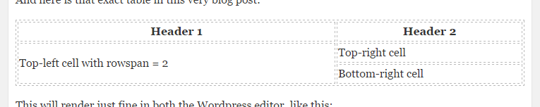
And here is that exact table in this very blog post:
| Header 1 | Header 2 |
|---|---|
| Top-left cell with rowspan = 2 | Top-right cell |
| Bottom-right cell |
This will render just fine in both the WordPress editor, like this:
And it will also render just fine in WordPress itself, like this:

You can check out how this rendered in Feedly by visiting the actual website for this blog:

Which is ugly, but technically just fine! (It’s only missing or ignoring the full-width css attribute.)
So, what went wrong with my previous post? In case you wouldn’t believe me (but you do, don’t you?!), here’s an annottated rendering of that post in Feedly:
Basically, the green bit should’ve come below the table, but instead it got lumped into the bottom right cell. If I check the rendered html in Feedly using the Chrome dev tools, I can see that it does indeed do this.
I’ve checked in my RSS feed and found the culprit, it’s actually WordPress that renders faulty html:
|
1 2 3 4 5 6 |
There’s a rogue Lesson learned: be wary of how WordPress will render your post. :-) |